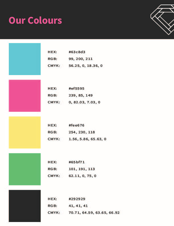
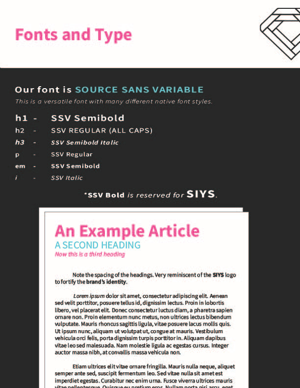
Struggle Is Your Success is an up-and-coming non-profit organization aimed at helping at-risk and struggling students find purpose through the thrill of entrepreneurship.
They needed a fresh, fun, and sophisticated look for their cause.
Their old look felt rigid. Giving off a corporate feel when it needed to appeal to youth and the parents of those youth. The basic diamond vector wasn't doing them any favours either.
And so I began with concepting.
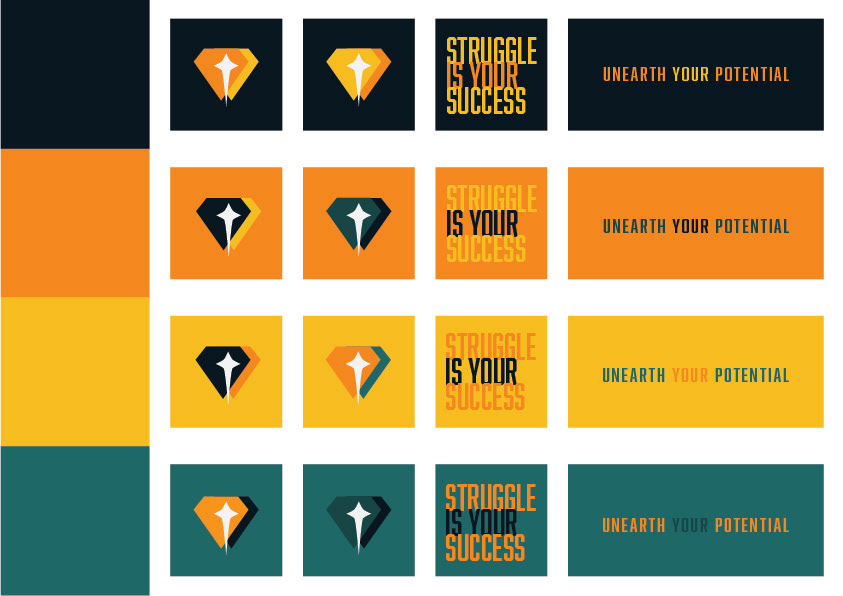
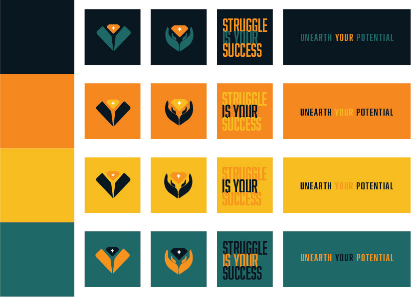
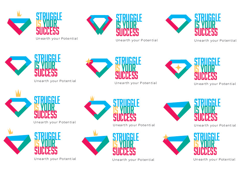
Early on I found a font that we liked but the conclusion was that the first renditions were too "boyish" and "crest-like." The last image's iterations ended up being too similar to Google's icons and we didn't want any confusion.
(Curse you Google for basically owning primary colours.)
But finally, I found it.
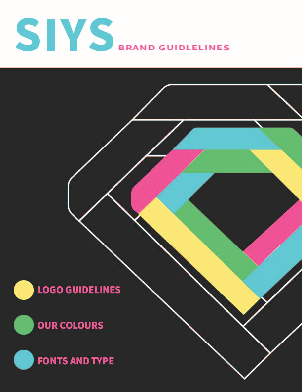
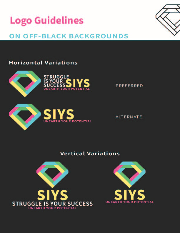
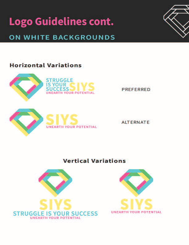
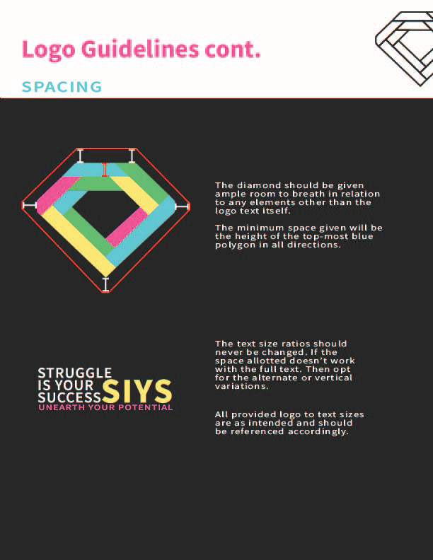
A simple change of font and opting for a more pastel feel brought the logo to life.
And with it, I was able to quickly give this charity an entirely new identity.
